A compilation of images from the barkbook app.

BARKBOOK: RESPONSIVE WEB DESIGN

Overview

Using persuasive methods to get users to make more sustainable choices when disposing of clothing

Process

Project Conception l Literature Review l Expert Consults l Iterative User Interiews
MY ROLE l Research Lead
TIMELINE l October 2021 - December 2021
TEAM l Tia Arcot, Jennie Lee, Sunny Sun, Jennifer Jia

Introduction

Problem
From our interviews and journey mapping we found that the main recurring issues were problems in the transparency in the adoption process both in what to expect from pet behavior and the application process itself.
Goal
Our goal was to create a responsive web design on mobile and desktop that would help first time adopters know exactly what to expect in the adoption process.
Solution
We created high fidelity mobile and desktop designs that used microinteractions and a main timeline page to direct users clearly through the process.

Journey Mapping

Process
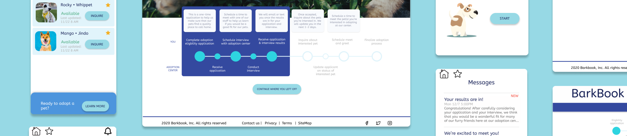
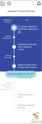
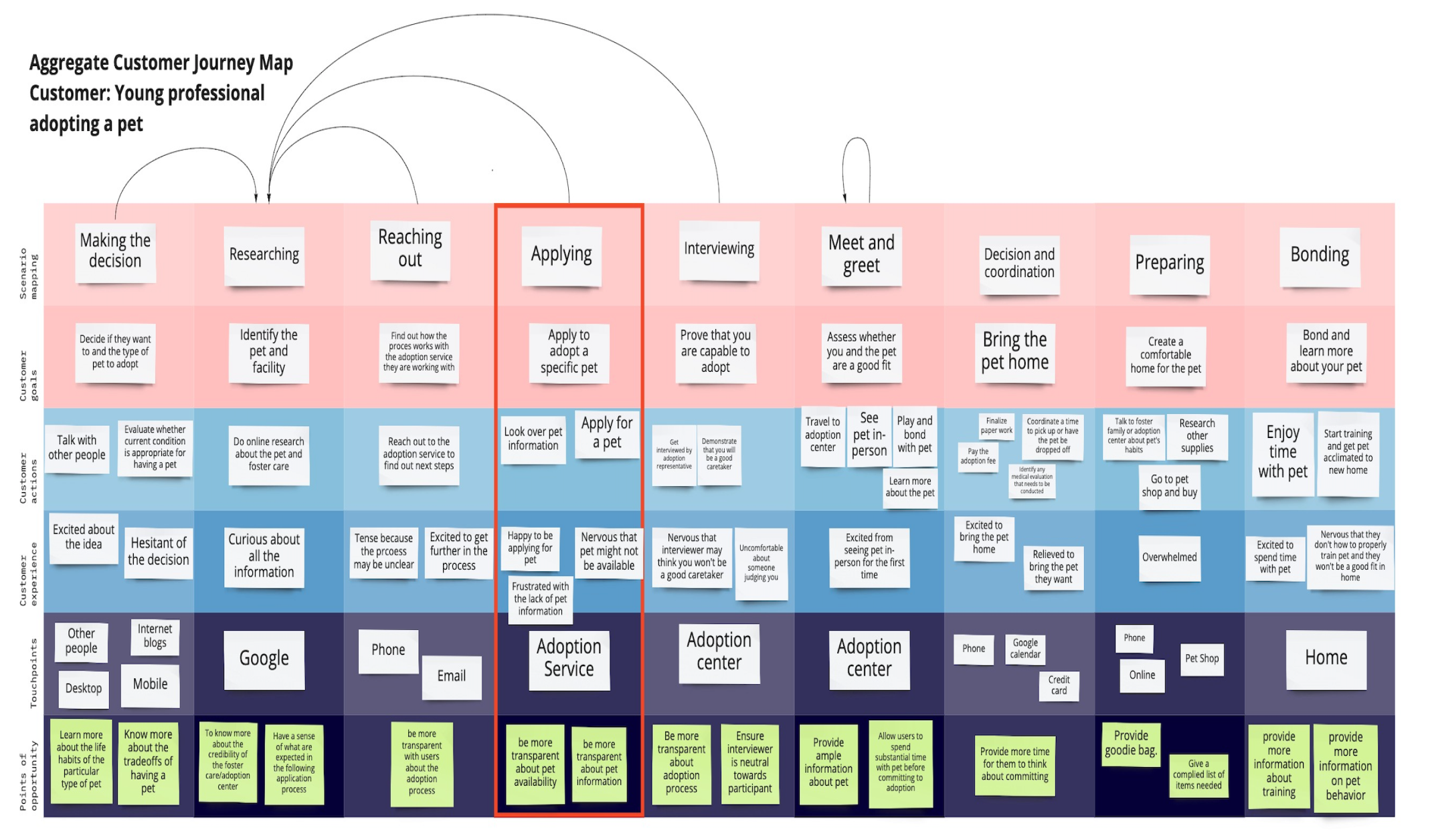
We interviewed 12 people through zoom (using directed storytelling) that had adopted or bought pets both during the COVID-19 epidemic and before. We then created journey maps for each and then created an overall journey map to present a user journey.
A journey map of the typical person going to adopt a pet. The one column highlighted is the applying part. The information in this column is customer goals, customer actions, customer experiences, touchpoints and areas of opportunity. Under customer goals is apply to adopt a pet, under customer actions is look over pet information and apply, under customer experiences is happy to be applying for a pet, nervous that the pet might not be available, and frustrated with the lack of pet information, under touchpoints is the adoption service and lastly under points of opportunity is be more transparent with pet availibility and be more transparent about pet information.
Insights
Pet adopters want to know what to expect about how to take care of a pet.
Pet adopters want to know to more about the personality of the pet.
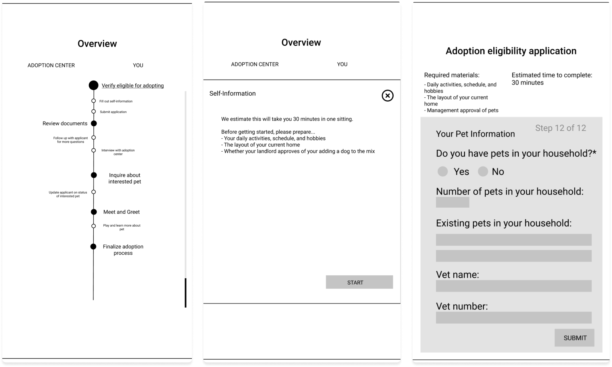
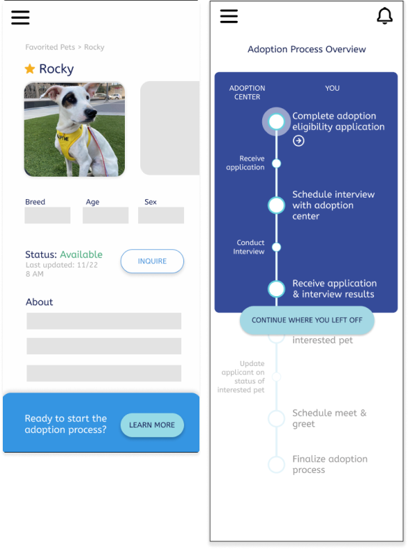
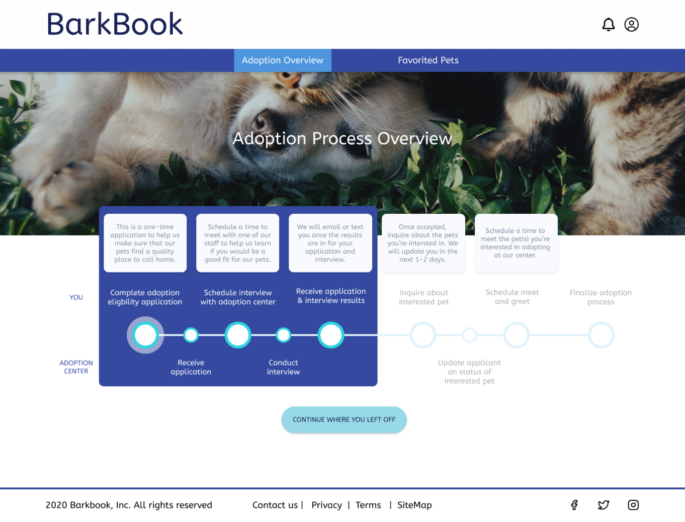
Pet adopters want to know what to expect about the adoption process.

Prototyping

Process
We all did individual sketching and came together to make a paper prototype of the mobile version first. We decided to make the mobile first because we thought it would be easier for us to transition from mobile to desktop. We had many sessions of critique and I mainly focused on timeline design and microinteraction implementation. I made sure to use my pyschology background to make sure those pages were easily understandable. It was challenging because we had a tight deadline and none of us had background as designers but we made sure that all of our design decisions were rooted in our research.
3 screens of a mobile low-fi prototype showing a rough sketch of the pet adoption timeline, a pop-up of the description once someone clicks on the timeline, and the last is the rough application.
Insights
Two screens of the mobile mid-fi prototype. On the screen on the left there is a hamburger menu in the top left and below that the name of the pet and then an image. Below that is age,sex and breed and then the status and a button next to it saying inquire. Under that is the about section and at the bottom there is a pop-up that says are you ready to start the adoption process? with a button next to it that says learn more. On the right there is the timeline from before with colors and now part of the timeline is highlighted in blue while the part the user is not on is greyed out. At the buttom at the highlighted part there is a button that says continue where you left off.
We found at this point a lot of parts of the design were easily understandable and we did not get a lot of comments in the crtiques but we did make a big mistake in user flow as it created confusion. Users thought they were applying for one pet but we actually had an intital general application to make it easy for both the adoption center and adopters to later match with specific dogs.

Solution

This clearly presents the adoption process for both adoptees and centers that are adopting out pets.
On the left there is the desktop version of BarkBook. On the top left there is the logo for barkbook and on the top right there is a bell and person icon. On the navabr below there are to categories: adoption overview and favorited pets. The timeline is the same as mobile one but it is horizontal and has the descriptions of each step above it.
On the right there is the timeline from before with colors and now part of the timeline is highlighted in blue while the part the user is not on is greyed out. At the buttom at the highlighted part there is a button that says continue where you left off. On the top right there is a house and a star and on the left top there is envelope.

Summary

Our solution seeks to help the adoption center by saving time by providing a centralized system that enables the center to catalog applications. It also improves the customer experience by knowing each step in the adoption process and knowing the expected time each step would take and when they would get a response. Providing sufficient information will save time for users and it will especially be clear what they must do. The timeline was the main feature of our desktop and mobile and has micro-interactions and is interactable to help streamline the process.

CONTACT